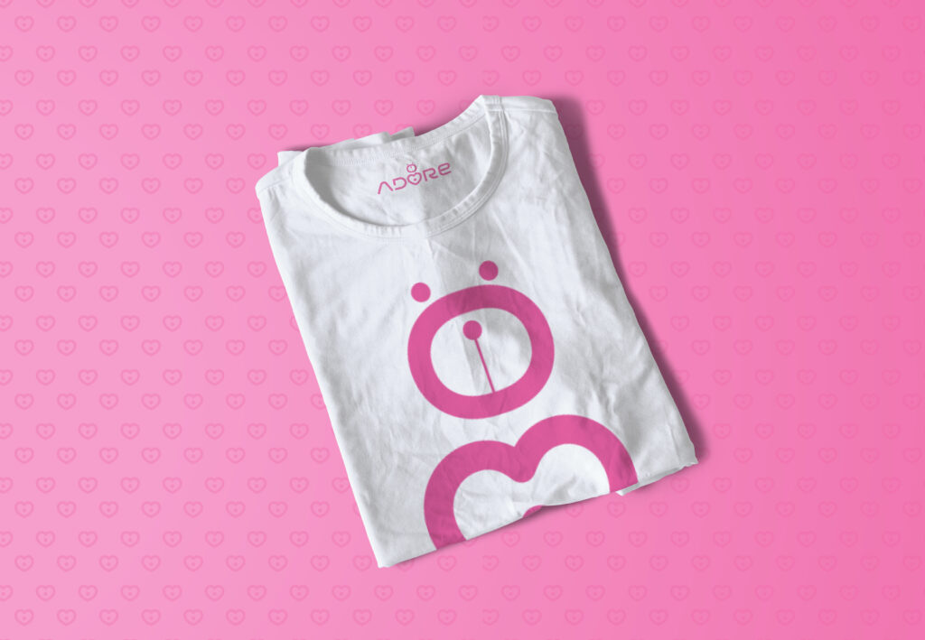
Adore Kids is a children-focused brand built around warmth, care, and joyful learning. They approached us with a clear intention: create a logo that feels playful and friendly for kids, while still looking safe, professional, and trustworthy for parents. The brand needed to feel instantly lovable, yet polished enough to grow with time.
What We Did
Logo Design
Color Palette Development
Typography Selection
Logo Usage Guidelines (Light & Dark Backgrounds)
Creative Approach
Here’s the thing. Designing for kids is not about being loud or cartoonish. It’s about balance.
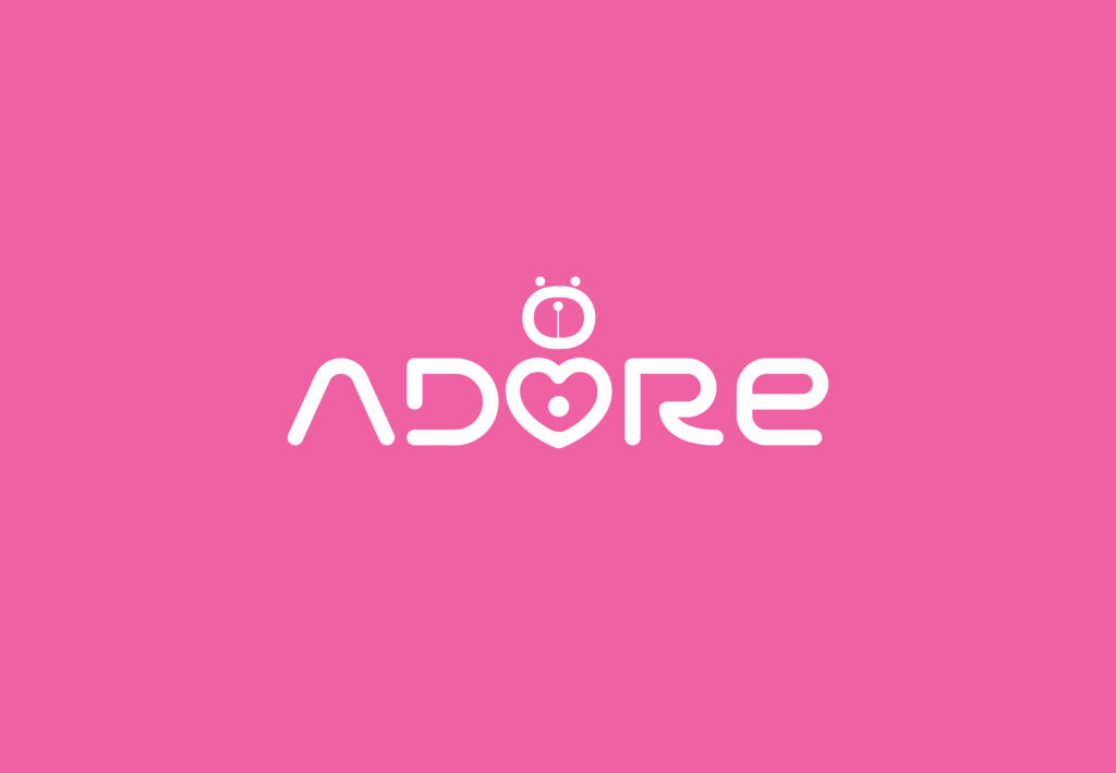
We created a logo that captures innocence, curiosity, and happiness through soft shapes, rounded forms, and cheerful colors. Every element was intentionally kept simple and expressive so it connects emotionally with children while reassuring parents that the brand is reliable and thoughtfully designed.
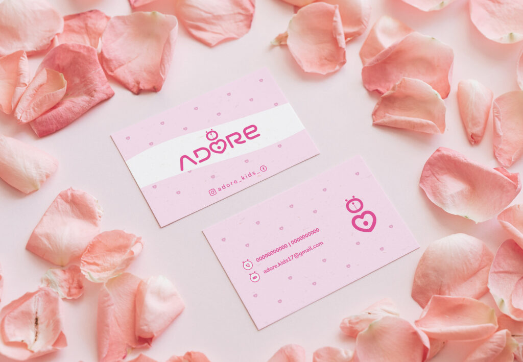
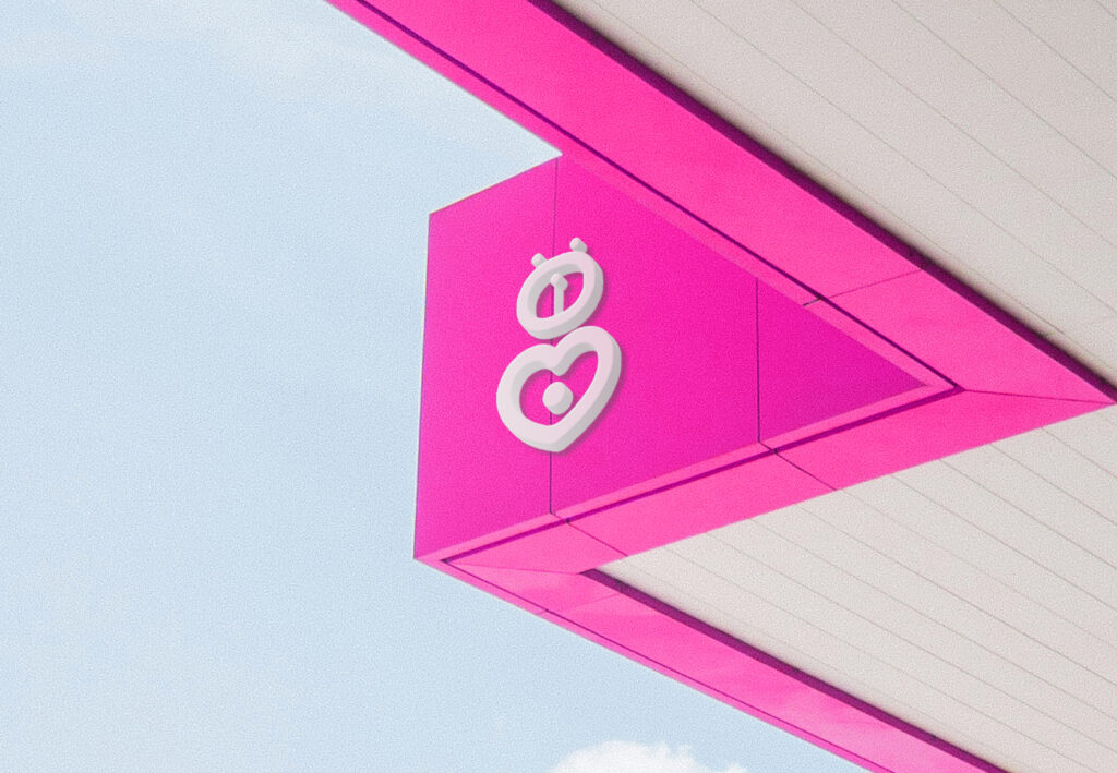
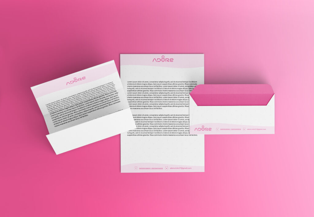
The visual language focuses on warmth and approachability, making Adore Kids feel like a safe, happy space where children can learn, grow, and feel cared for. The logo was designed to work effortlessly across digital platforms, print, packaging, and future brand extensions.
Result
Adore Kids now has a charming, recognizable logo that instantly communicates its purpose. The identity feels joyful without being overwhelming and professional without feeling cold. It sets a strong foundation for brand growth while building immediate trust with parents and excitement with kids.